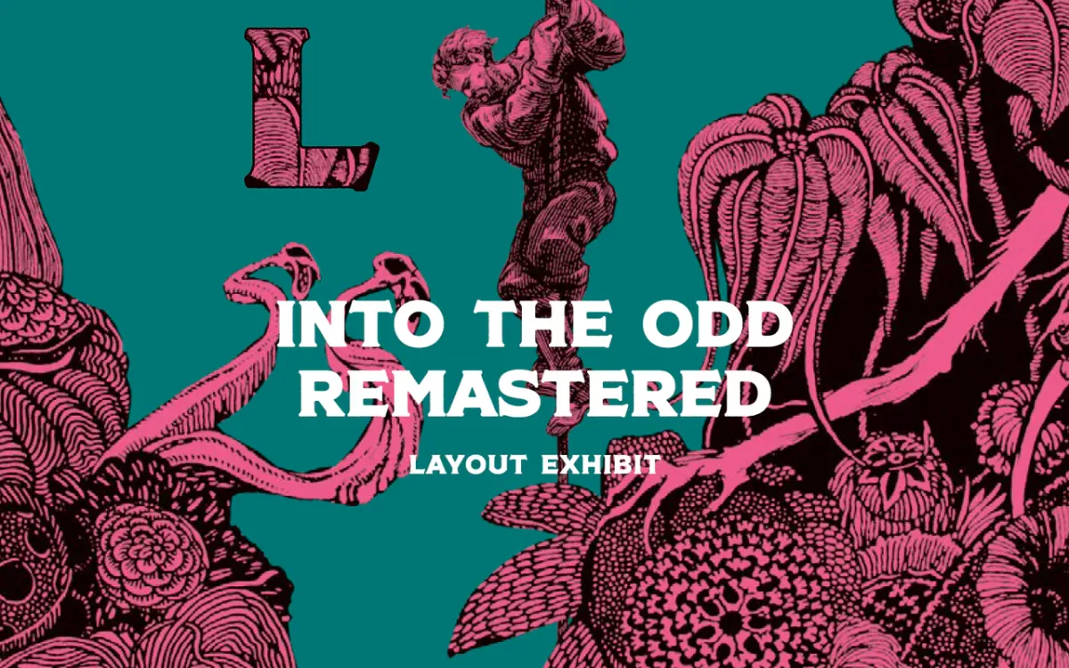
Into the Odd (Layout Exhibit)
The rules-light, flavor-heavy roleplaying game has a layout few can replicate.

Into the grid system.
Into the Odd Remastered is a rules-light, flavor-heavy roleplaying game of industrial horror and cosmic strangeness. It's creator, Chris McDowall, wrote it, while Johan Nohr did the visual design.
This is an exhibit, which means we'll analyze Into the Odd to learn some of its secrets. Plenty of rpgs use a column-based grid, but few have done it as well as this.
We are going to gloss over a lot as we focus on layout. If this exhibit excites you, I recommend buying the book in print at Noble Knight Games or digitally at DriveThruRPG. Every purchase you make gives a small amount back to Explorers for web maintenance.
If you found this layout exhibit without seeing the others, I recommend checking out our exhibition of Brindlewood Bay's manuscript grid—a very different game and layout.
Antiquity meets modernity.
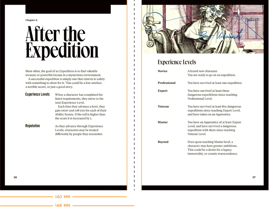
Into the Odd is a clicking, humming little book about steam engines and chattering spiders. The digital version doesn't do it justice. In person, the book feels like it was found on a book collector's shelf. It mingles historical photography and woodcuts with funkier modern typography and polish.
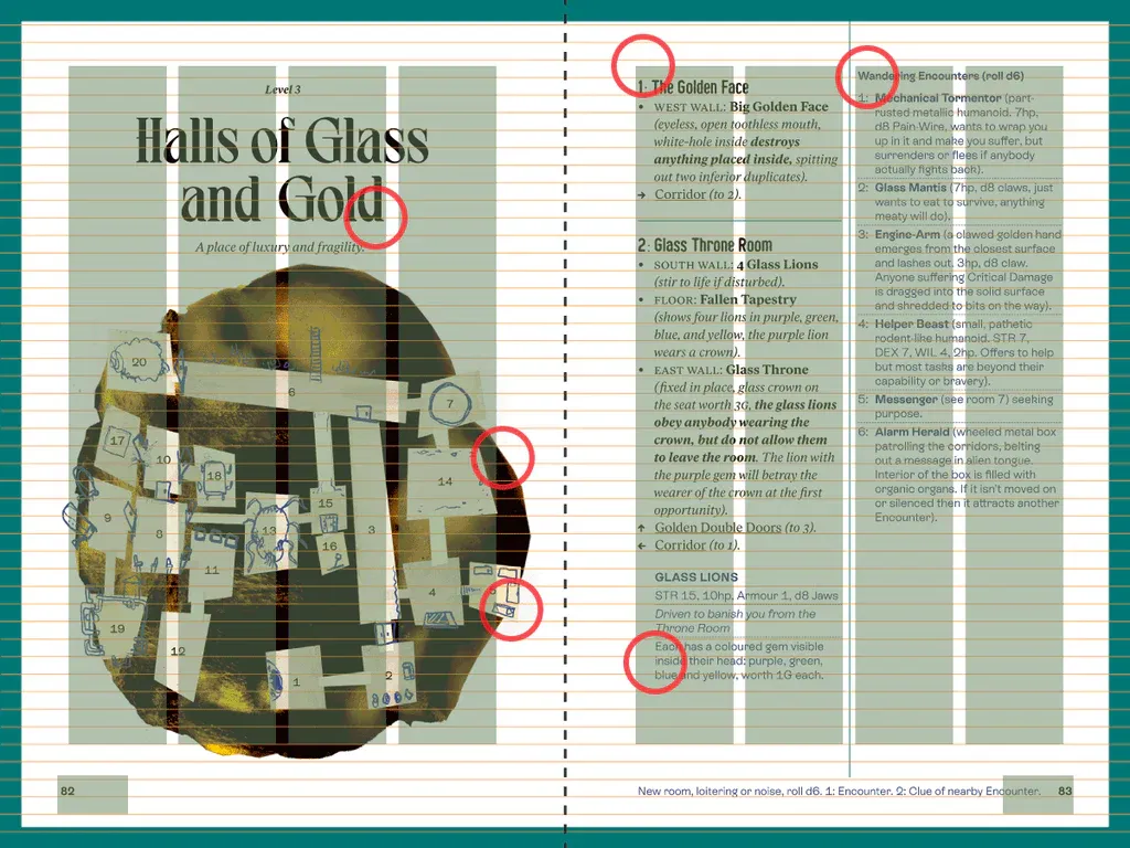
The layout brings them together into a functional presentation. Despite using stylized type, ornamental art, and collaging it all together, ItO is tidy. It breathes. The rules are light, and the writing is pithy, but also because of the subtle use of multi-column grids. That's right. Multiple grids. Nohr uses three different column grids. So let's get into it.
Five Explorer observations.
1. Old margins. New frontiers.
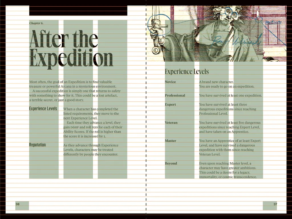
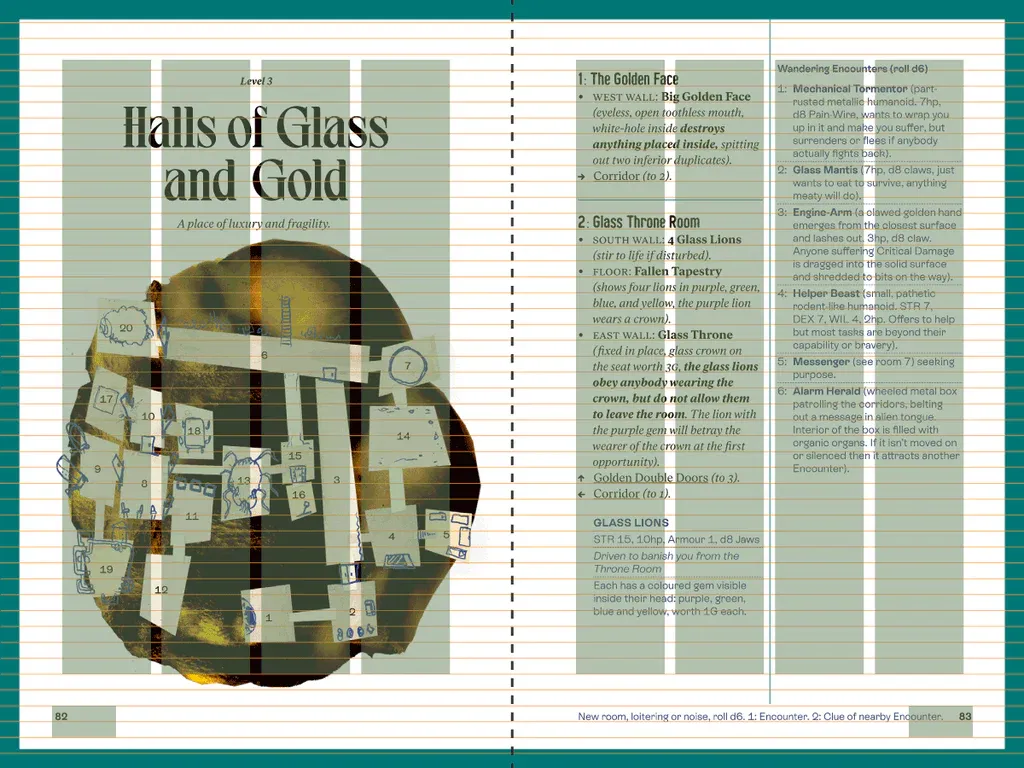
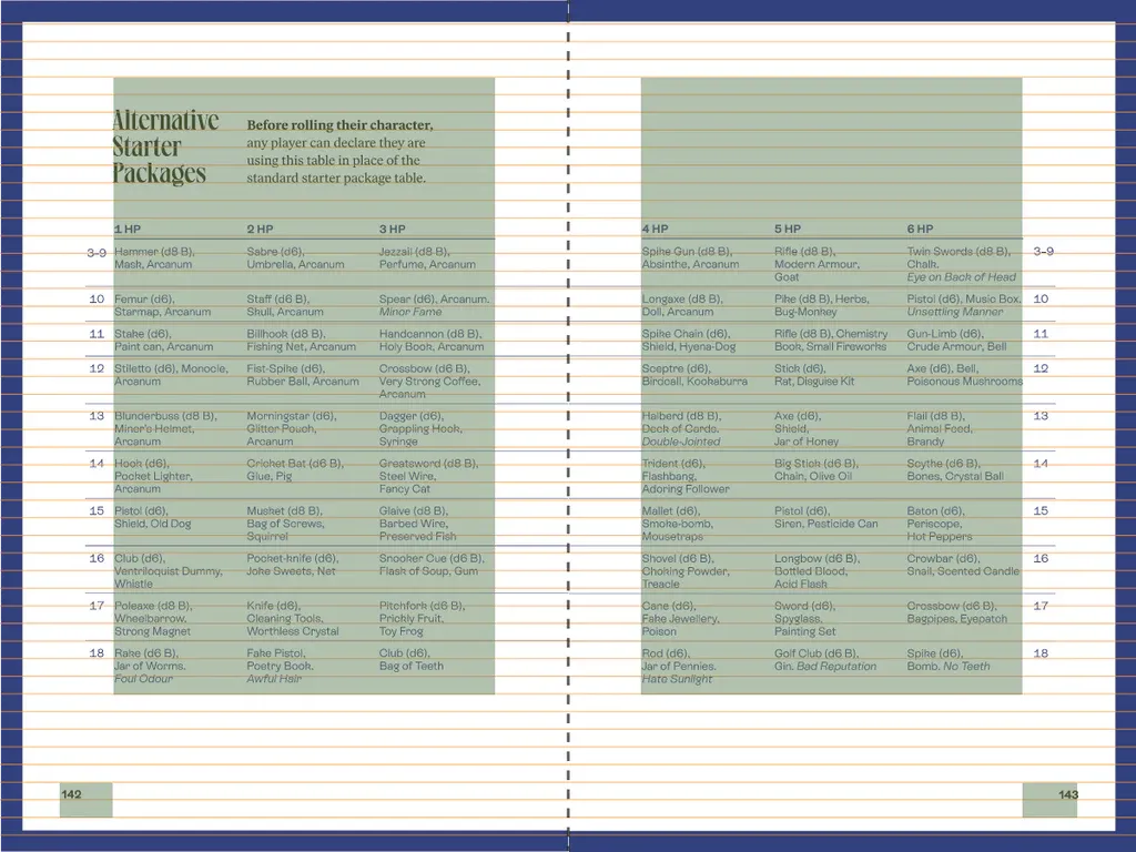
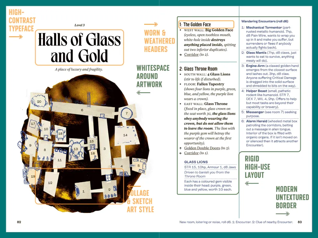
Into the Odd has three colored borders representing three different kinds of content. (One might call these "common regions" for those who read our Gestalt Laws article.) Black signals mechanics, teal indicates adventure content, and blue is used for roll tables. When you're using the book at the table—these indicators are like roadsigns for page flipping.
2. Yes, there's a baseline grid.
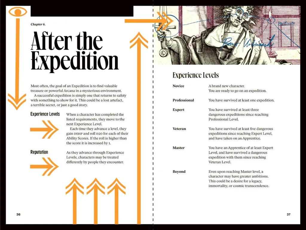
Into the Odd uses a baseline grid to unify components from one spread to the next. Notice how the headers, body text, and markers rest on one of the gold lines. That's the baseline grid.
Traditionally, baseline grids are built around a document's body text. First, you figure out the line height of your body text, and then you take that measurement and break the spread into horizontal slices of that measurement. (Bonus points if you can divide the entire page's height into whole units of that measurement.) Don't worry, though, you don't have to do it by hand. Most design programs have settings to automatically put in baseline grids.
After that, everything falls onto those lines like notes in music. The baseline grid is a tempo, the unused lines are silence, and the copy and visuals are sound. Notice the silence between the massive headers and the copy that follows. It's consistent. It's rhythm. It's Mozart for the eyes.
Johan executes this technique well. The page is divided into almost perfect whole units of the baseline grid. The bottom margin, for example, is almost nine rows of the baseline grid, and the top margin is almost exactly four.
3. Whitespace is an ally.
The alleys are slightly thicker, the margins are generous, and if you look at the spreads with adventure text, some columns are deliberately left empty. The biggest mistake novice designers make is filling these spaces. Whitespace, when applied judiciously, guides the eye. Johan uses those spaces to enforce that sense of hierarchy and rhythm. In the narrower format of ItO, that's a boon.
There's a misconception that the reader gets stuck in whitespace. On the contrary, if you strike the right balance, whitespace can slingshot the user from one section to the next. Notice how in the above example the whitespace reinforces the scaffolding of information from one level of importance to the next.
4. Balance is found in the extremes.
Expansive whitespace, reliable type, and clear division between art and copy gives Into the Odd its formality and refined style. Meanwhile, the art and type gives it a Baroque patina and mystery.
When those two opposing forces work together, we get something more compelling than one alone. Many great games strike a balance with their extremes. Into the Odd is no different.
5. Breaking the grid isn't as odd as you think.
The guidelines of the grid system are—surprise—more guidelines than rules. Great layouts tend to break the grid a little. Here's why you might do that:
First off, breaking a pattern can deliberately call attention to a spread, page, headline, or element. This is often done with artwork or headers. In the case of Into the Odd, however, it's for the second biggest reason you might break the grid.
Sometimes, visual elements look imbalanced if they're laid out with math.
If you think back to the principles and lessons of design, you might recall that the human eye perceives things differently than they appear. Letters, words, headers, and graphics can have an optical center that is different from their mathematical center. When this happens, you need to override the grid.
Visual designer, Johan Nohr, puts it best,"I always break my own grid on pretty much every page. Let text blocks be wider or taller if need be. I trust my eyes and gut more than the grid."
It sounds counter-intuitive, but it's true. The grid helps until it doesn't.
Final Takeaways
Into the Odd Remastered is simple—hard to pull off, but simple. There are no tricks or revolutionary techniques. It's on exhibit because it does a lot with the basics of graphic design. Intentional, careful, and diligent design will get you far; it can even make one of the industry's best entries.
Most fans of weird fantasy vet the mechanics of Into the Odd. If you're worried about the visual design, don't be. You can find it in print at Noble Knight Games or digitally at DriveThruRPG.
Until next time, never stop exploring.