Graphic Design 101 (A Beginner's Glossary)
How to speak "designer" and how to solve any design problem.

How to talk (and rework) design.
Design principles are like designer vocab. If you know them, you can talk about them (and learn from them). This particular list is the Explorers' version. It's been distilled from textbooks, classes, and websites.
Don't rely on it. It's incomplete and meant to be a field guide for understanding "Explorer Speech" aka, “What the heck is Clay going on about?”
If you’re the kind of person who likes tools—I certainly am—I recommend looking at this like a beginner's checklist. It’s a self-diagnosis sheet. Each principle builds on the next. Each principle is made stronger by the others. It's a glossary and a field manual that helps us point at the moving parts of a design in the wild.
Why isn’t this working? You might ask. Then you look at the principles and say, “Oh, I don’t have enough of principle ________.”
Design principles. Make them or break them.
A great design either breaks purposely from the consensus or never breaks them at all. The list is not prescriptive. It's not meant to rattle around in your head and be used devoutly—find what you like and throw away the rest.
Your tastes will tell you which principles you like and which ones you like broken, devalued, or barely used at all.
One last note: this article was previously on explorersdesign.com. So, if you like what you read here, you’ve been missing out.
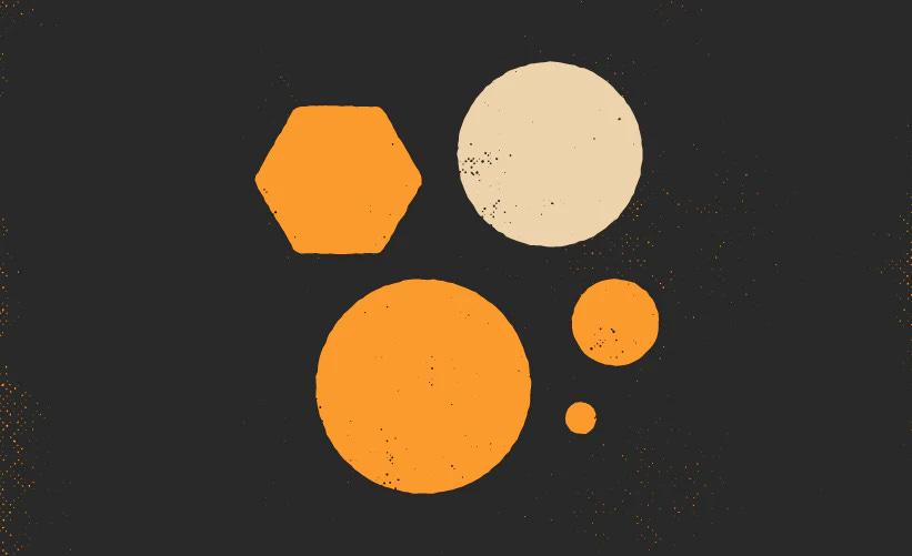
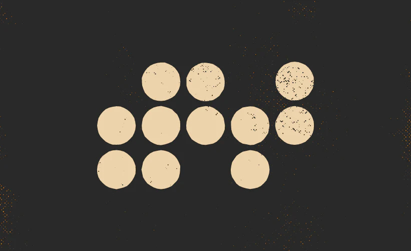
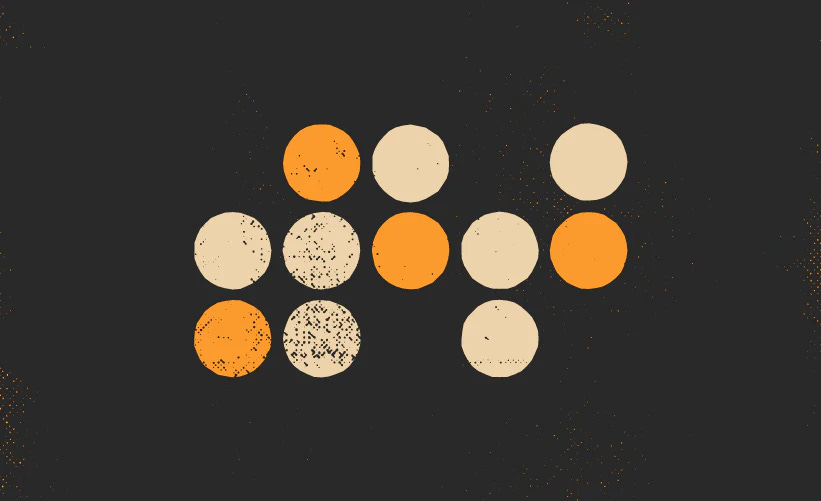
Contrast
Contrast makes elements stand out from each other. That tension is the seed of storytelling. It can be created by giving different sizes, weights, shapes, colors, and more to elements. Contrast can also signal to players how important a rule, page, or character is. If one thing stands out from the rest, it earns greater attention.
How to increase contrast. Use contrast to pull a visual element away from its neighbors. Start by changing one attribute (color, size, shape, etc.). It sounds easy, but remember, there's a balancing act. You still want your visual elements to match the zine, book, or rpg. The more contrast you add to the collection of elements, the fuzzier the overall concept and themes become.
How to reduce contrast. I cover this in another article, Gestalt Laws, but I'll give you a sneak peek. The more elements appear similar, the more the reader associates them as being related. This can be a powerful method for guiding the reader on how to use them. A great example of this is attributes and skills on character sheets. Less contrast between two attributes called "mind" and "muscle" can be helpful if they behave the same mechanically. In the article Design Lore, we name this psychological phenomenon, but for now, trust your instincts.
Balance
Balance is the mysterious sensation created through symmetry or asymmetry. In a more technical sense, it's when two groups of elements mirror each other across a centerline. Symmetry creates a sense of order and comfort. Asymmetry creates a sense of chaos and exciement. More often than not, you'll invoke asymmetry by feeling it out. Symmetry is more objective and pragmatic.
Why we create symmetry. Balance is usually your default goal. For psychological reasons, balanced objects often feel reliable, sturdy, or dependable to our human brains. Most audiences, because of their cultural diet, put an over emphasis on symmetry. On a spread, it can make the pages appear full or "complete." On a book cover, it pulls the eye towards the silhouette and title.
Why we create asymmetry. Asymmetry should be done carefully with a ten-foot pole. Deliberate imbalance can evoke excitement, tension, and caution. Done correctly, it knocks your reader on their backs. It's especially effective on a granular level. For example, an imbalanced piece of art can excite the reader. You can use a layout like a counterweight to get the best of both worlds: An imbalanced piece of art on a page that makes it feel right. We cover that a little more in the layout section of Explorers. The best place to start learning the grid is by reading the basics of the grid system.
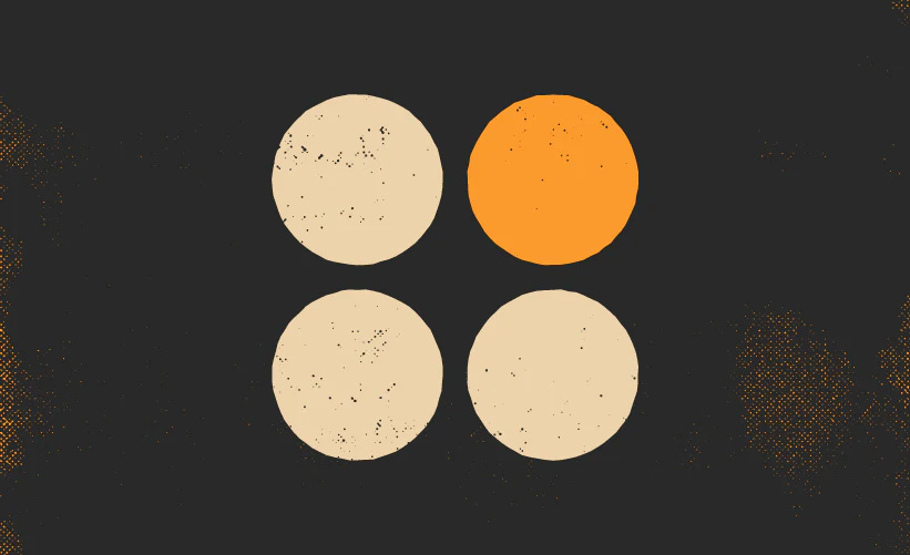
Emphasis
Emphasis is when certain parts of a design stand out from the rest. On the flip side, it’s also when certain elements start to fade into the background. Emphasis combines contrast and balance and can be heightened with additional design principles.
How to create emphasis. It might sound like emphasis is the same as contrast, but it’s contrast in relation to the greater whole. A good example is when an RPG zine purposefully makes a page or spread stand out from the rest. To add emphasis, start with the big picture. What commonalities does everything share? Make a list, and then slowly make the thing you're emphasizing deviate from the group. Or, if it’s easier, dial down the contrast in everything else. Make them feel samey so your special little thing stands out.
How to reduce emphasis. A common problem across the RPG design world is when you get unintentional emphasis. You’ll know you’ve done it when your pre-readers and playtesters get hung up on something. When this happens, figure out what’s making it stand out. Odds are it’s the contrast and balance—or another one of this article’s design principles.
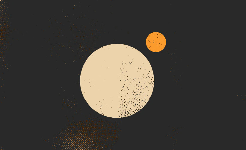
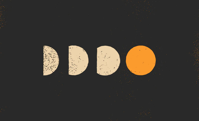
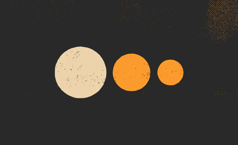
Proportion
Proportion is how the size of elements relate to each other. Larger elements are often seen as more important, while smaller elements are treated as the exact opposite. When proportion is combined with emphasis, balance, and contrast, it creates a sense of hierarchy, which we’ll get into later.
Why make something bigger? Bigger elements make smaller elements appear either less important, more dependent, or more focused. A great example of this is the header. Big type in a headline tells the reader that any smaller type is a chunk or piece of the greater whole. If we see a big headline and then two small but identical subheaders underneath, we expect them to be related to each other and dependent on their larger parent header.
Why make something smaller? There's a phenomenon with especially large objects. If we can't see all of them, we perceive them less as detailed objects and more as simplified concepts or backgrounds. Make them too big, and the reader's eye might glide right over them. I made this mistake once by making my page numbers so big that people didn’t think I added any. All I had to do was make them a little smaller. Impercievably.
Whitespace
Whitespace is the area of your canvas that goes unfilled. It does not have to be white or empty; it’s the absence of things that grabs our attention. Because it's subtle, whitespace is the single most powerful (and challenging) principle of design. Space makes the boundaries, position, and qualities of our elements more apparent. Space can also make things feel unmoored.
How to add whitespace. Treat whitespace like salt. It magnifies the impact of the other design principles. The easiest way to add whitespace is by having an underlying structure and logic. If you’re in layout, your grid system will tell you where the whitespace can exist without being arbitrary. That’s the secret. Whitespace needs a purpose. It needs to be adding contrast, symmetry, emphasis—something to whatever isn’t the empty space. Start with the content and let the form follow.
How to remove whitespace. Only reduce whitespace after interrogating every other design principle in your design. If the art, logo, or layout feel unfinished, and nothing else can shake that feeling—you have too much whitespace in the wrong places.
Note: Many artists use "whitespace" and "negative space" interchangeably, but we don’t. Negative space is a whitespace that forms an image by omission. Since whitespace isn't always negative space, using the terms interchangeably is confusing and imprecise.
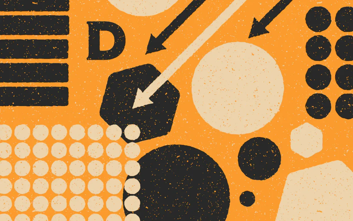
Movement
Movement, or "momentum," is how a design or element guides the eye across a composition. It can be achieved with lines, positioning (like arranging from top to bottom), emphasis, hierarchy, and more.
How to increase movement. The easiest way is to use symbols and shapes we associate with movement, like arrows and patterns. The second method is to use a reader's subconscious bias to your advantage. For example, our eyes try to spot unlike objects on a page. If you add emphasis, their eye will be drawn to it, and you can probably guess their eye's path to focus on it. Similarly, if you fill a space with something identical (or nothing like whitespace), they'll naturally drift over it.
How to decrease movement. The reader looks at your rpg with built-in assumptions. For example, if your audience is a Western reader, they'll scan your page from left to right, then top to bottom. You'll have to decide whether to work in tandem with their biases or work extra hard to correct them. To reduce movement, identify what causes it, then reduce what is reducible and create barriers along its path.
Hierarchy
Hierarchy is how elements are ranked sequentially by importance or dependence. It’s a subjective sensation created by combining other design principles like contrast, balance, emphasis, and proportion. For example, Big and different things are often perceived as more important and noteworthy.
How to increase hierarchy. The trick is consistency. Sort your content into levels of importance, then decide what traits or qualities will be exhibited at which level. Create rules. Make certain headers for certain levels the same font and size. Then, when making sequential nesting information, figure out what can be shared vertically by all the elements so that they’re still seen as a group with varying levels.
How to decrease hierarchy. It’s rare to have too much hierarchy. It’s a lot more common to have unintentional hierarchy. This problem rears its ugly head when people assume a rule is a subsystem or that a certain concept is exclusive to a class or ancestry. When this happens, lock onto the thing and tear it apart. What makes it look like it belongs to the group it’s being lumped with?
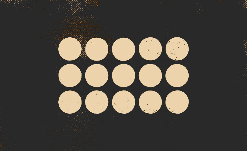
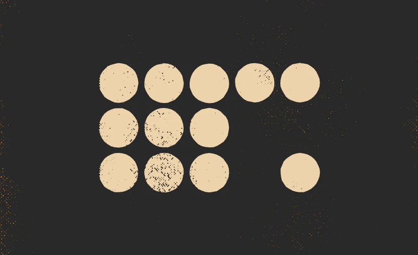
Repetition
Repetition is when similarly designed elements repeat in succession. It can be achieved by reusing color, weight, shape, and even wording within sentences. It reinforces an idea or creates a sense of unity across your work and is the main building block to rhythm and pattern.
Why we create repetition. Repetition evokes a sense of uniformity, predictability, and dependability. That makes it a great trait when grouping things mechanically or aesthetically. Skills often look repetitive in traditional games because they use the same procedures, for example.
Repetition can also compare otherwise dissimilar things directly. For example, if you design two different locations on a hex crawl with certain repetitive elements (same color, type treatment, iconography), you tell the reader they are related despite being different. This dissonance can be a powerful trigger for imagination.
When we don’t create repetition. Repetition is boring when it goes on for too long. Regular interruptions, changes, and re-starts stop the repetition from overstaying its welcome. We call these interruptions, changes, and loops rhythm and pattern.
Rhythm
The spacing, movement, and whitespace between elements create a sense of rhythm. Consistent rhythms are often calming or easy to follow, while inconsistent rhythms are often exciting. Think of a game whose book feels “orderly,” like Old School Essentials. How does your eye move from spread to spread? Now look at a book like CY-BORG. How does your eye move differently there?
How to create calming rhythms. Look at your RPG's pages, spreads, and overall manuscript. How similar are the individual "beats" within the work? The fewer the beats and the less they change, the more calming, comforting, and trust-building the book becomes. A beat, in this case, is a chapter or section.
Old School Essentials has little contrast or change from one beat to another. It has even less change from one page to the next. Instead, there are similarities and repetition with every page flip. The titles look the same. The columns are always exactly two. The tables rarely look different. There is still excitement in the content, but the overall ethos of OSE is to feel stable. It is essential. It's an official document that wants to be valued as one.
How to create exciting rhythms. Change things up. Challenge the reader's expectations. Look at an RPG like CY-BORG. Every page is a little different and every chapter and section waxes and wanes in depth and density. Sometimes, you flip the page, and it's mostly art. Other times, it's a chart of dials and widgets to play with. Adding energy to your RPG's rhythm is a delicate dance. Too little, and you'll end up with parts of an rpg that don't match the overall mood. Too much, and your reader might struggle to understand what the mood is.
Pattern
Patterns are when repetition, rhythm, and other elements come together to create expectations in the audience. Using the same layout at the start of your book's chapters is an example of a pattern. It helps the audience learn the game and use your book. It also draws their attention when you break the pattern.
How to create a pattern. Patterns are all about loops. At some point, your art, typography, and graphic elements must repeat in the same order. That last bit can change from project to project. Some games, like MÖRK BORG have almost no pattern except in the macro. Meanwhile, a much quieter game like Whitehack 3rd Edition has it in spades. Look for sequences. Find commonalities. Repeat them.
Why patterns come last. Patterns are created through mastery of other design principles. If you’re struggling to make patterns it’s likely two reasons. One, your game’s structure isn’t clear enough. Or, two, you’re failing to create repetition, emphasis, hierarchy, etc.
It’s not foolproof.
The theory will only get you so far. Start designing, and you’ll build a vocabulary that works for you. Maybe you’ll add other principles or remove some of mine. Either way, let me know if you find this helpful in the comments below. Remember to like, share, and subscribe. Yadda-yadda.
Until then, never stop exploring.