Grid System 101 (A Beginner's Glossary)
A not so short tour of your rpg's layout, its different parts, and how to use them.

Introduction
I routinely say that design comes with equipment, like an adventurer’s pack clinking with thieves' tools, part of becoming a good graphic designer is knowing the name of your tools.
The grid system is my toolbox of choice. When putting your RPG into a layout, the grid system is what keeps you from tipping over. It marries all of your elements, like typography, maps, and copy (the words) into a unified whole. If a game designer were a carpenter, the grid is their workbench. It’s what everything gets built upon.
Why learn the terms?
95% of graphic design is Googling how to do stuff. That’s hard when you don’t know what to put into the search bar. Once you know the grid’s key components, you won’t have that problem. Instead, you’ll be pulling off tricks other people will attribute to brilliance. In reality, it will be your herculean patience.
Thank you for reading Explorers Design. This post is public so feel free to share it.
Anatomy of the Grid

Format
The format is where your grid and layout live. It’s your canvas, A4 page, US Letter, web browser, phone screen, zine spread, or back of a cereal box. The format locks you into certain design constraints. That’s part of the fun. A lot of game designers have made a name for themselves by working in unusual formats, like pipsqueak zines or massive fold-out maps.
Beginner Tips
- Start with something easy. A5 or Half-Letter make good little zines and books. If you want something more traditional like D&D or Call of Cthulhu, try US Letter or A4. The former has great form factor in the hand while the other gives you room.
- Think about what your final product will be. If you or your audience is printing your game at home, make sure it’s a format that’s possible with your printer.
Advanced Tips
- Start with your typesetting first. Once you know your fonts, sizes, and leading, you can zero in on line width. Once you know the exact proportions of your writing, you can find a format that fits it.
- In general, smaller formats favor simplicity and larger formats favor complexity. When we stray from those deterministic qualities, we create tension through density, white space, and audience expectations.
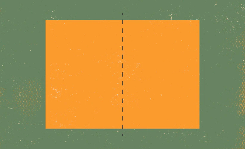
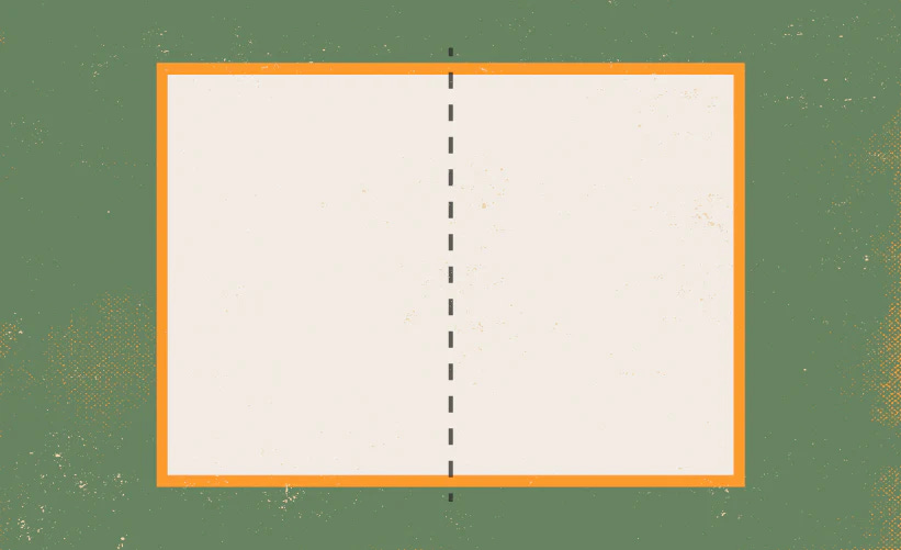
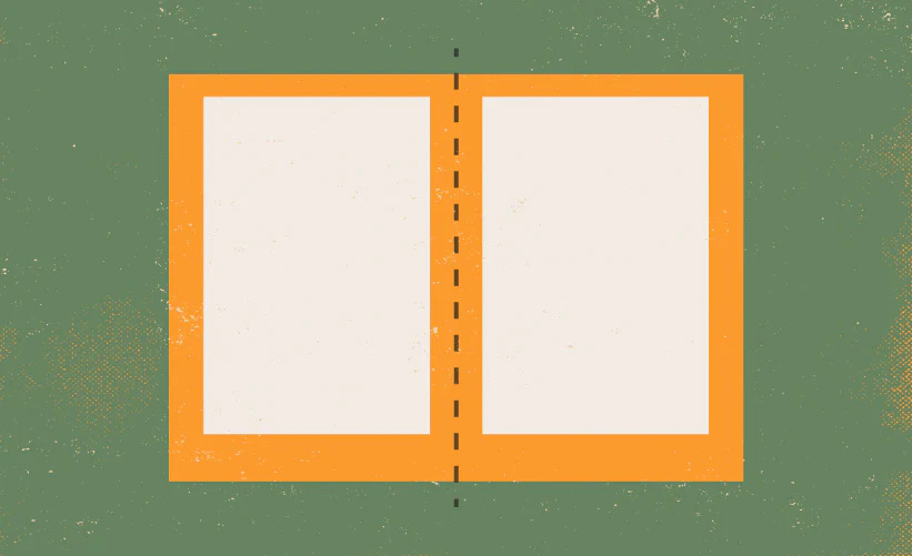
Spread
In RPGs, the spread is the combined visual when your reader opens the book, newspaper, or brochure. Normally, it’s two pages side-by-side, but that rule quickly falls to the wayside when we start to experiment with foldouts.
Beginner Tips
- Think of your book or zine in pieces that nest inside the others. There’s the book, the sections, the chapters, the spreads, the individual pages, and then the bite-size pieces on that page. Your spread is like a mini-chapter within the chapters.
- Avoid creating content that spills outside of these boundaries. Everything should start and finish within its respective page, spread, chapter, or section. Don’t let that cool passage about lizard wizards spill out of its spread into another spread that’s about something else.
- Don’t put things that need to be legible in the middle of the spread where the gutter is. We’ll cover more about the gutter later.
Advanced Tips
- Use the dividing line in a spread to signal a shift in your content’s purpose. For example, if you have rules on the first page, you can put examples or diagrams on the second page. The audience will automatically assume they’re connected because they’re on the same spread, but now you can make the transition without wasting ink writing about it.
Bleed
The bleed is where your layout forgives tiny deviations in the production process by extending past the edge of the format. Full-bleed images or background textures should extend into “the bleed.”
Beginner Tips
- Don’t worry about setting up a bleed unless you plan to use a printer. If you are printing your project, look up the printer and see if they have a recommended bleed size (they usually do). If they don’t, use the default suggested by your software.
- Bleed is important in games showcasing large art and graphics. I’d avoid that kind of project early on.
Advanced Tips
- If you’re doing something a little different, don’t forget to revisit your usual bleed settings. Printing on a riso printer, using woodblock, collaborating overseas, etc. You might need a bigger or smaller bleed.
- Never forget: Every printing press whispers its own language, and the person operating the machine is the only person who can hear it. When in doubt, talk to the operator.
Margins
Margins are the “whitespace” between the edge of your format and the outer edge of your content. The margins are the “here be dragons” of the canvas. Content that pushes into the margins does so dangerously.
Beginner Tips
- Half an inch is a good minimum for American formats. One centimeter is pushing the limits but is doable for international sizes. Do not fear large margins.
- A good litmus test for margin sizes is to hold a book. If your thumb covers text just by holding the book open, you might want to increase the margins. This advice is less valuable if you play for the Lakers or clean your gutters without a ladder.
- When in doubt, steal your margin size from a similarly sized book. This is a good way to evoke the look and feel of certain genres.
Advanced Tips
- Sometimes you’ll have to let stuff “break the grid” and dip into the margins. Always trust your eyes. More often than not, only you will know when the grid has been broken.
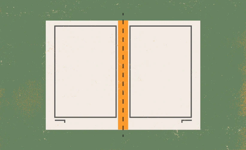
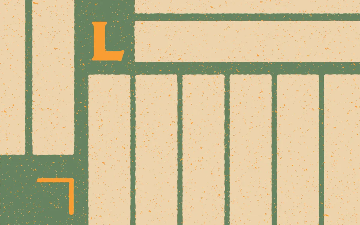
Gutter
Some design programs use the term gutter and alley interchangeably— but for our purposes, the gutter is the combined margin between two book pages. If the book is thick and bound, the gutter will "eat" more of the page as it sinks into the spine.
Beginner Tips
- Don’t span anything important across the gutter. Your maps will become fragmented and hard to read after the gutter has eaten its midsection. Unless your type is massive—never put text across the gutter.
- The gutter gets worse the thicker the book and its pages are.
- Different book bindings create gutters of varying intensity. Staple and perfect binding are the least destructive, while saddle stitch and everything else can absolutely devour pages.
Advanced Tips
- You can compensate for the gutter by making your “inner margins” slightly wider than your other margins. It’s usually not worth considering until you hit a > 40-page count with your average page thickness.
- Reverse engineer your ideal adjustments from other books. Printers sometimes provide samples or their own recommendations.
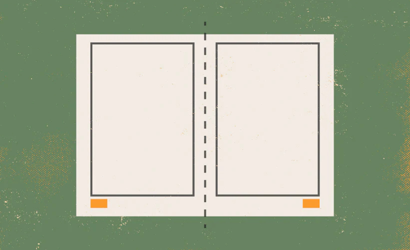
Markers
You’ll most often find markers inside the margins—designated places for repeating information like page numbers, chapter headers, and author names. Markers can live anywhere in the margins but are often consistent.
Beginner Tips
- Always have page numbers for manuscripts over three pages. It’s useful.
- Keep the placement of your markers consistent. They’re meant to be usable; they get less usable when they’re part of a scavenger hunt.
- Avoid redundancies. You probably don’t need the game’s name in your markers.
Advanced Tips
- Marker placement can signal which side of the spread the reader is on. If you think the reader will read your book as a pdf, position the markers on the outer edges of the page.
- Markers can be a subtle (or hamfisted) way to convey tone. Page numbers in the center of the page are an old-school printing press thing. Massive page numbers tend to be in Avante-Garde or pop productions.
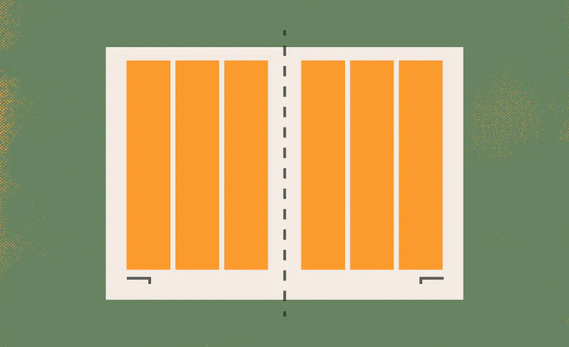
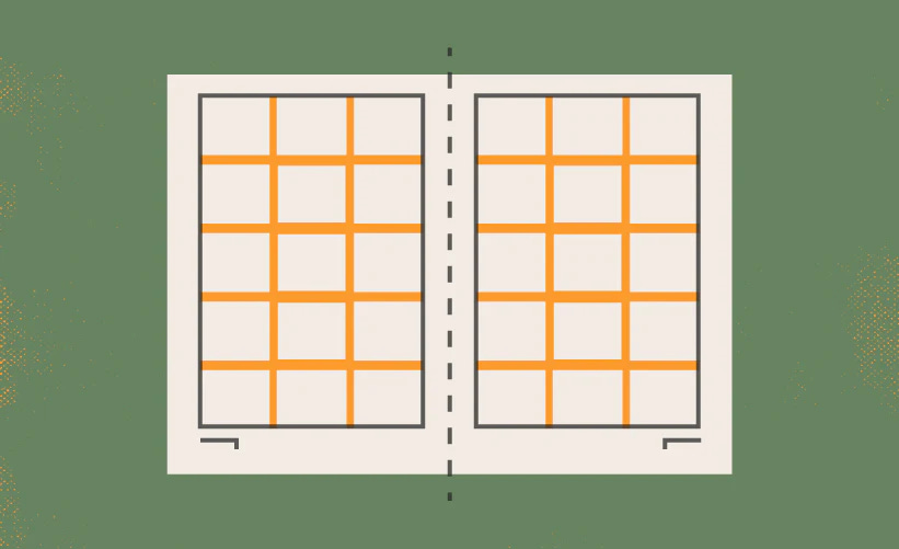
Columns
Columns are the zones that stretch vertically from margin to margin. They’re the most important part of your layout because they subdivide your canvas into pieces that can be combined, sub-divided, and used for pacing your content.
Beginner Tips
- Fewer columns are easier to grasp. For first-timers, only make as many columns as you’ll use for your text. In the future, you’ll have more columns in the grid for added granularity. For now, focus on making a clean and uncluttered grid.
- Ensure the column or combination of columns you use for your text is wide enough for easy reading. The average character width of any prose should be between 45-65 characters.
Advanced Tips
- Create more columns than you need. Six, eight, and twelve make great bones.
- Use an odd number of columns to create an automatic asymmetrical interest.
- Start with your typefaces, fonts, and leading before you make your columns. Once you know your ideal combination of typefaces, fonts, and sizes, you’ll know your ideal text box width. Your columns should equal that width alone or when combined with their respective alleys.
- If you’re working in digital, use an even number of columns so your page can break symmetrically with an alley running down the center of the screen. Twelve is an industry favorite.
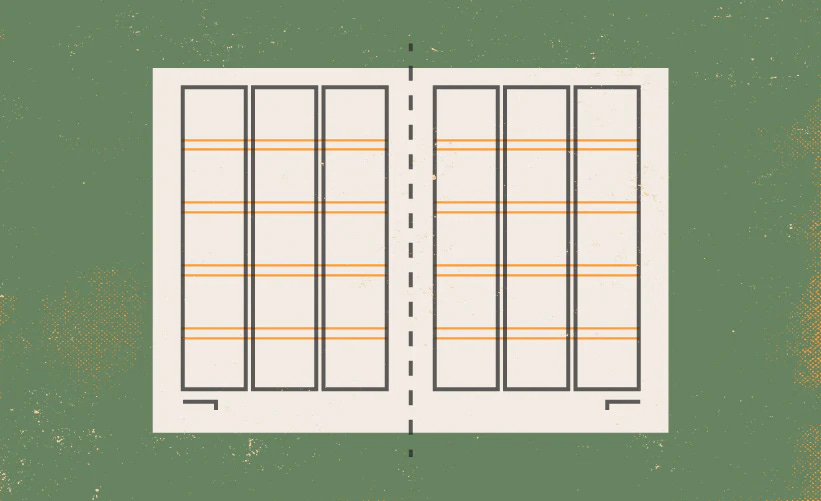
Flowlines
Flowlines are lines that divide your canvas into rows from one margin to the other. They form a checkerboard with the columns and guide the eye across the page. Some grids have one flowline near the top called a hangline. Others might have none at all.
Beginner Tips
- Don’t use flowlines for your first project. Modular layouts—the kind that have columns and rows—create a whole new set of challenges.
- Instead, create individual guide lines on an as-needed basis. You’ll get 90% of the functionality from flowlines without doing the math during setup.
Advanced Tips
- If you start with your typesetting, you can build your entire grid’s flowlines and rows around your type’s leading or baseline grid. For example, if your baseline grid is 12 pts, you space out your flowlines in multiples of that leading or baseline. By doing it this way, you’ll know exactly how many lines of text fall into any row or module.
- Most formats do not subdivide evenly into your type’s line height or baseline grid. When this happens to you, just leave the leftover spacing in one of the margins. In most designs, you only need the flowlines between the margins anyway.
- Use a flow line at the top of your pages to create consistent section and chapter headers. A lot of books have gorgeous whitespace between their headers and contents, this is usually because they set a “hang line” for those titles to rest on.
Alleys
Alleys are the buffer between individual columns and rows. They act like wool between plate mail, an invisible space that keeps your design elements from grinding against each other. Without them, designs fall out of balance.
Beginner Tips
- Use alleys as your guide for space between elements.
- Make your alleys as wide as your text’s line height or “leading” (rhymes with sledding). When in doubt, make your alleys 12 pts wide. This usually works well with body text.
Advanced Tips
- Use the same technique for your alleys as you did for your flowlines when making modular grids. This will result in proportional grids that are easier to work with.
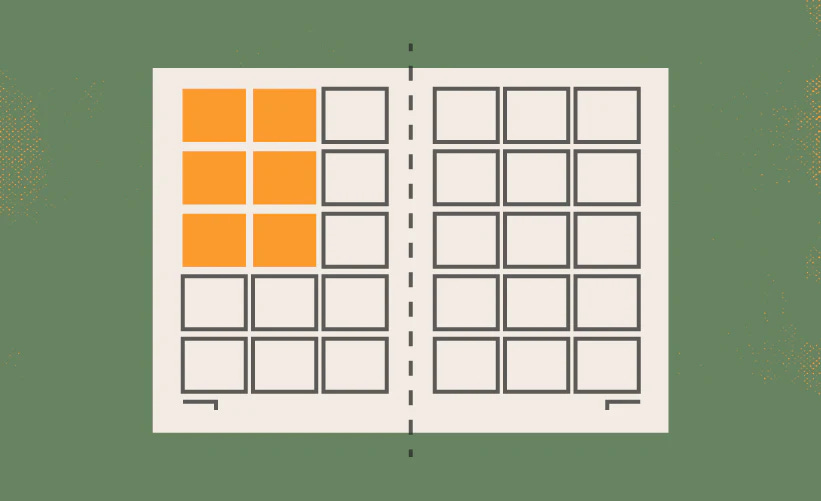
Modules
The modules are areas of space where rows and columns intersect. They’re the building blocks of modular or Swiss layouts. When modules link together, they create spatial regions that can be used to create patterns from one layout to the next.
Beginner Tips
- Only make modules if you’re going after a modular or Swiss layout. Otherwise, this part of the grid system won’t be worth the squeeze.
Advanced Tips
- Modules work best when their dimensions can be subdivided into lines of text. If you know your manuscript’s line-height or baseline grid, you can make your module a multiple of that measurement.
- The strength of the modular grid is its ability to arrange complex pages. Games that are prose-heavy and can’t be broken into parts don’t get a lot of mileage out of modular design.
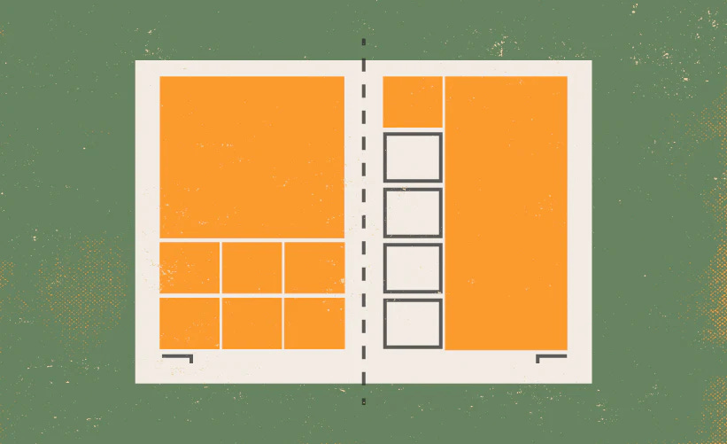
Regions
Critters like maps, illustrations, and copy reside within one or more modules. When we link or designate certain modules for that content, we call them spatial regions or zones. Think of regions like rooms to a dungeon. When we build layouts, we don't always know what will live inside them, but if we build them, they will come.
An important thing to remember is that sometimes, we don't put a region on the page where it could feasibly exist. When we do that, we're saying that nothing will live there. It's designated whitespace.
Beginner Tips
- Create patterns. What does the average chapter page and spread look like with just its grid system and regions? Do that for every type of page in your game, and by the time you’re done, you can plug-and-play the content.
Conclusion
There we have it. A very basic, non-comprehensive, but still too long for social media explanation of the grid system. Now that you know the names, you can look up YouTube videos and forum debates about the best techniques.
I’ll end this article by giving you a quest: find some books and dissect them. Try to look past the page and see the grid system. What kind of margins does your favorite book have? Which games have a lot of columns and which ones hardly have any at all? Lastly, ask yourself this, what’s working and what isn’t?
Don’t limit yourself to games and books everyone says are great. To quote John Waters, consume it all. The good and the bad. You’ll learn a lot from the greats but some things can only be learned from failure. No one said that failure had to be just yours.
The best thing about design is that it gives you a new way to read and appreciate things. Until next time, never stop exploring.