Brindlewood Bay (Layout Exhibit)
Gauntlet Publishing's most innovative system shimmies into a new art direction.

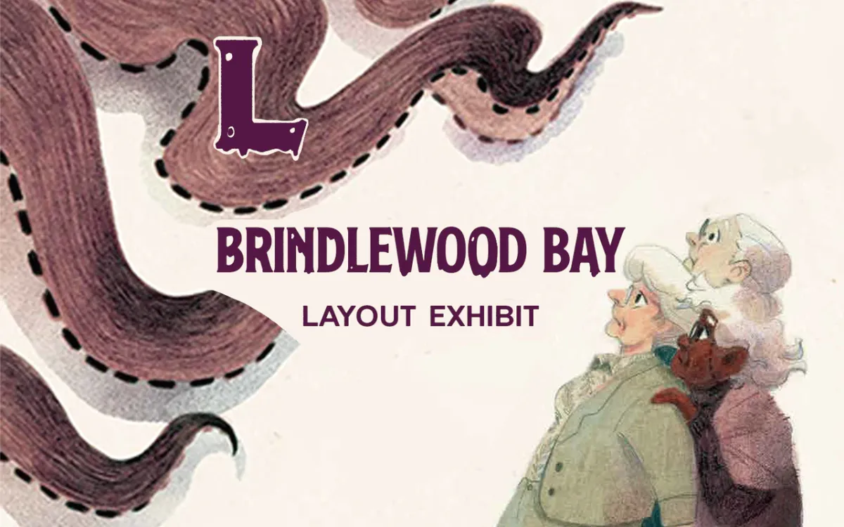
The Golden Girls have a new look.
Brindlewood Bay is a roleplaying game about a group of elderly women in a mystery book club who find themselves investigating (and solving!) real-life murder mysteries. It's Murder She Wrote meets Golden Girls meets cosmic horror.
In this exhibit, we're going to explore five things: what kind of mystery game Brindlewood Bay is, the physical details that make it different, the execution and reasoning behind those characters, how they directly relate to the layout, and the overall effect these design choices have on Brindlewood Bay as an idea and book.
If this exhibit excites you, buy the game at DriveThruRPG. Every purchase you make supports Explorers at no cost to you. And if you like this and want to see more, check out the Into the Odd Remastered exhibit—a different game with very different goals.
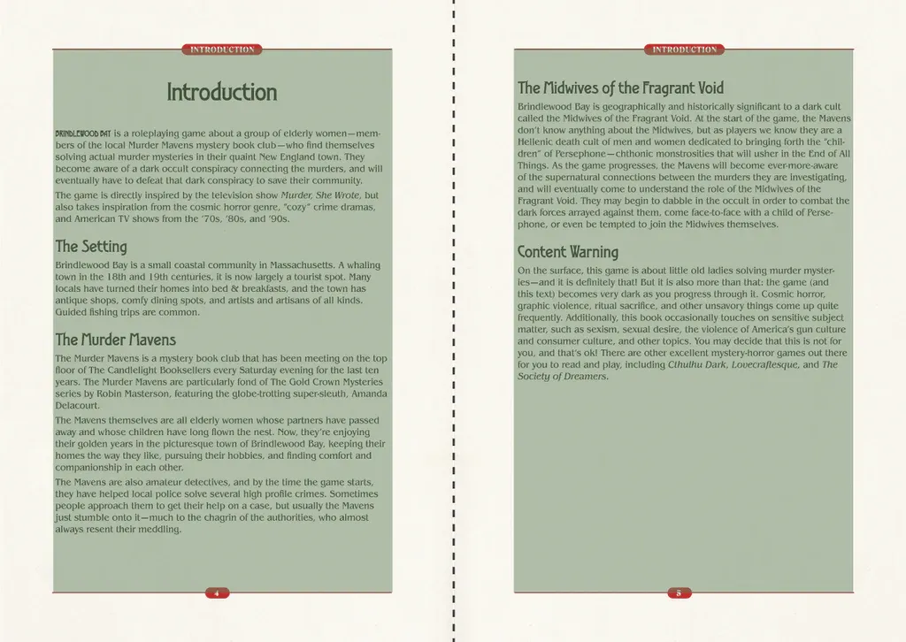
A different kind of mystery game.
We have a horde of options when it comes to investigator rpgs. Call of Cthulhu, Mutant City Blues, and Bubblegumshoe come to mind. Brindlewood Bay, however, stands apart by being open-ended and unfixed.
That's because while the clues, characters, and setting are written in ink, the actual relationship between those things—the location of the clues, the motives of the characters, and the solution to the mystery—the "truth"—are created by the table and their dice.
The GM or "keeper" picks from a list of clues as the mystery unfolds, and the players invent a narrative that connects them. Then, they roll dice to see if their theory has twists or dramatic surprises.
Therefore, the joy isn't found in uncovering the "true story" but in creating a story that feels true to the investigation. It's less dry and far messier, like a writer's room or improv theater.
The matter-of-fact prose, technical text, and plain layout are, by comparison, cut and dry. They don't demand interpretation or attention to detail like Mothership, Mörk Borg, or Necronautilus do. The writing and layout are singular and straightforward, albeit repetitive and maybe laborious.
This stylistic choice, simple layouts with directorial language, is a trademark of Gauntlet Publishing. There are few moving parts like equipment charts, random encounters, or sub-systems because the core system is plenty demanding as it is when the fiction can abstractly change from moment to moment.
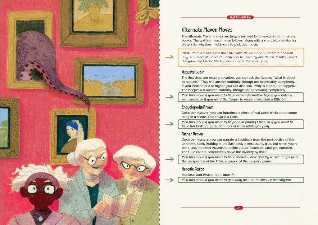
Even its art by Cecilia Ferri is warm and homespun but not intricate or distracting. There's nothing to interpret in these illustrations; they're seldom dense or ornately detailed, like a game on the opposite side of the spectrum: Silent Titans. (The most opposite example I can think of.)
In a game like Silent Titans, the more you look at the art, the more you notice. In that game, the art is a psychedelic fever dream with landscapes reminiscent of Hieronymus Bosch. Dense with characters, action, and multiple stories in one frame. Meanwhile, the work of Scrap Princess, in a game like Veins of the Earth, while laid out similarly to Brindlewood Bay, uses rough sketch work to create less literal interpretations of what's being shown. Those illustrations depict monsters, characters, and places like shadows on a cave wall.
Brindlewood Bay's art isn't like either of those. If I had to put them on a line, Ferri's work represents the opposite end of the rpg art spectrum. The art is familiar. It reminds me of old cookbooks and kid's literature like Frog and Toad. Is this a bad thing? My answer is no. It has different goals and meets them with a satisfactory sip-and-sigh. But more on that later.
How is this linked to layout?
Layout is not independent of anything. It must change, live, or die depending on what fills it. This means the rules, writing, illustrations, editing, and everything in between must relate to margin-size, typesetting, and the grid system.
A layout cannot be examined without examining its root causes. Therefore, writing, editing, illustrations, and rules are still, in some ways, about layout.
I also have a theory. One that will probably die as I grow as a designer. I think every choice you make has consequences. And I think every one of those choices decides your game and how it feels.
This shouldn't be controversial. And I think that theory will last forever.
Here's the controversial part of the theory: I think every rpg has an equilibrium, a unique point of balance that can make it great. Not just good but great. It's different for every game and depends on the artist making it. The point of balance is where the artist's intent and the audience meet. And by balance, I mean emotionally resonant (be that emotionally deep or shallow) and interactive in the way only rpgs are.
My thesis for Brindlewood Bay is that it's close to—maybe even at—its point of balance, set by its intended audience and the designer, Jason Cordova.
The core mechanic and its emergent gameplay are dynamic. They require the players to think fast, talk sharp, and juggle multiple mutating clues and theories. This design choice is exciting, demanding, and not intuitive.
Meanwhile, on the opposite side of the proverbial seesaw, we have the physical manifestation of this game—the writing, editing, illustrations, and resulting layout. They're not demanding of interpretation like a Gygax diatribe, they're not hiding anything for suspense or playing on the timing and meter of writing like The Isle, and it's not trying to unseat the reader and keep them guessing with art and expressive type and layout like Mörk Borg. These design choices are calming, approachable, and intuitive.
I argue that Brindlewood Bay made these choices intentionally. By looking at some of the observations later in this exhibit through that lens, we gain a greater understanding and appreciation for the creators who made them.
But enough about that. Let's pivot to the observations.
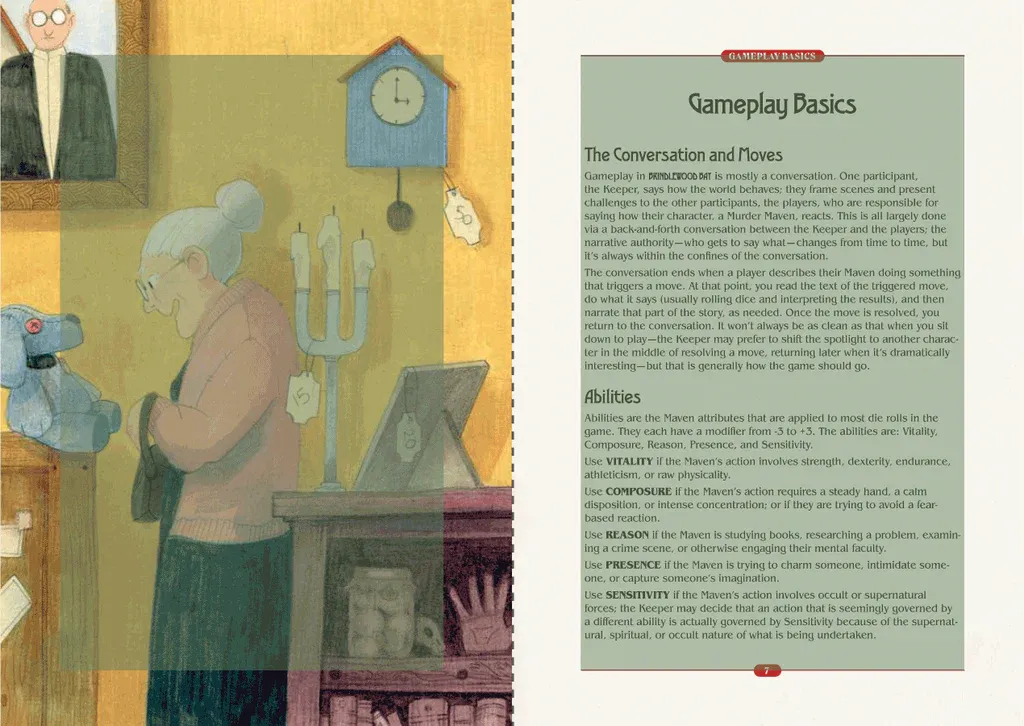
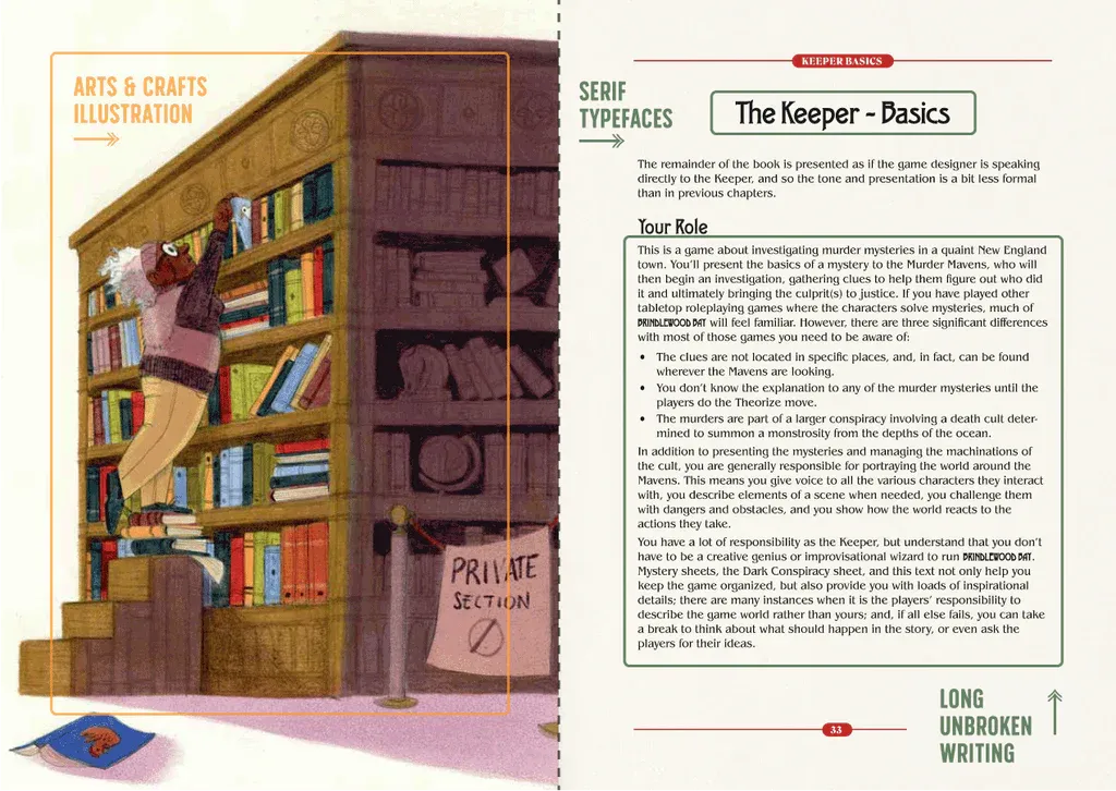
1. Always consider wider inner margins.
The inner margins are slightly wider than the outer margins, counteracting the effects of the gutter. Brindlewood Bay isn't massive, but with over 150 pages, it is thick enough to gradually drift the content inward toward the spine. Hence the subtle asymmetrical balance.
If you've read the exhibit for Into the Odd Remastered, you know margin sizes are big for me. The reason is simple: done poorly, it ruins books.
This is especially true with manuscript grids because nearly all of your text is affected by the snafu. That's why it's important to do a few things:
- Dial in your margins sooner rather than later. Check after finishing a spread.
- Always edit margins and markers in parent pages (aka "master pages") to make sweeping changes painlessly.
- Research your binding technique. Some are greedier than others.
- Always print a proof copy so you can make changes.
2. Why minimal key formatting works.
There's no universal rule about when to bold, italicize, color, or differentiate keywords and phrases. Some games do it to well, others fumble it. Here at Explorers, successful executions have three commonalities:
- Good formatting is consistent
- Good formatting is unobtrusive
- Good formatting is only as much as is necessary
Brindlewood Bay satisfies all three (though its consistency dips in other ways). When it formats key information, it formats sentences and paragraphs. Not a single word. That means the shift from core text to key text happens in long notes instead of sharp, punctuated blips like what you see in Old School Essentials.
It's not better. It's just different. What's important is how a game makes it their own. Brindlewood Bay's longer italicized phrases and red-tinted asides are also consistent in their tone. They always signal the author speaking directly to the reader in a transparent way. That's the secret sauce. Bad formatting yells over a game's voice. Good formatting listens. Really good formatting harmonizes. That's what Brindlewood Bay is doing.
3. How to make optimal line widths.
Since the manuscript grid only has one column, text width is crucial. Brindlewood Bay's average line width is between 70 and 75 characters. That's near the ceiling for optimal line widths in printed products.
Any longer and readers are likely to lose their place or grow exhausted as their eyes trudge from one side of the page to the other.
I prefer even shorter line widths and paragraphs, but—again—that's a stylistic decision. The team has met the requirements owed to their readers, and the rest is their signature.
This is why manuscript grids and layouts tend to be in smaller formats. Generally, the margins need to compensate if you have a one-column layout. It can be tempting to let line widths expand so they fill the page, but unless you scale the type up—that will make for an awful reading experience. This book is the right width for a manuscript layout without using more compelling proportions.
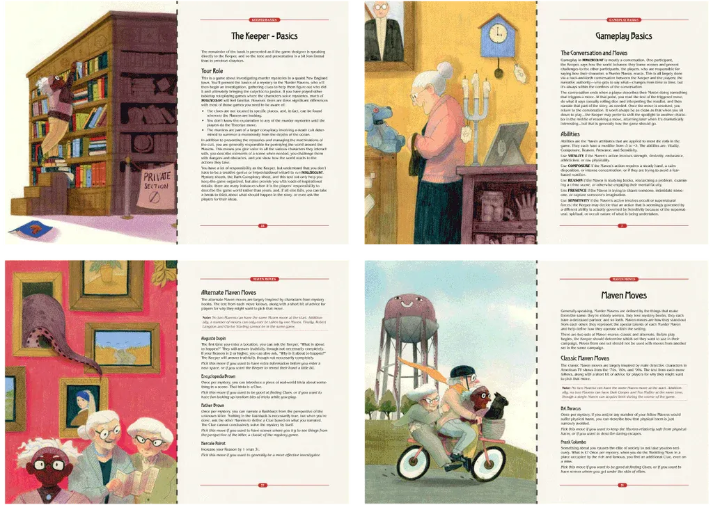
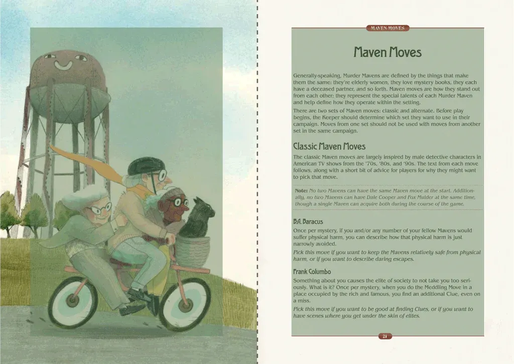
4. The art of illustration is more than being pretty.
Most roleplaying games use multiple sizes of art. Not Brindlewood Bay. I think this is a great example of designer intent. The art is always full-page and usually on the left half of the spread (opposite a new chapter header).
This imparts two benefits.
First, it plays on the art's strengths. By being larger, you see the illustrations' texture, shading, and homespun details. It feels homemade, like crocheted mittens and chocolate chip cookies. It's a vibe that feels innate to the setting—cozy, familiar, a little kooky, and ripe for subversion with horror.
The second benefit is that it helps with navigation. The illustrations are like big, flashing road markers. They stand out. When flipping through a page, if you see a flash of color, you know you're passing chapters like off-ramps on a road.
5. Leverage audience expectations.
This game looks like a book, more specifically, a novel. What does this convey to the reader? How does it reinforce the game's themes?
A novel is approachable—most people know how to read one. It invites you to sit down and digest it one page at a time. It's also thematic. A novel feels cozy. It invites indulgence in an armchair, maybe some tea.
How might other rpgs be read? What does the format, layout, art, and writing suggest? Brindlewood Bay conveys a lot about pace, volume, and tone without words. It's leisurely, cozy, and slow-burning.
This is an indicator of great design. It primes the audience. Jason Cordova's voice, Cecilia Ferri's art, and Harald Eckmüller's layout solve the game together as complementary forces.
Final Takeaways
Brindlewood Bay's rules and play style stand out. The physical design, meanwhile, emerges opposite of it—like a dance partner. It does not do the same moves but opposite moves to ease the readers into the Brindlewood Bay rhythm.
One could describe the book as hyper-approachable. The game aims to teach first and entertain and inspire second, a goal usually backed by predictable patterns, conversational language, and unadorned visual techniques—all of which I think we've explored and discovered in this particular exhibit.
If it works on you, you are its intended audience. If it doesn't work for you, the next question is: what would?
What I like about Brindlewood Bay is that it's a system that feels tailored perfectly to the tone and tastes of its fiction. The clean, gentle layout feels right for a game about elderly women solving mysteries. Especially when the fiction's deeper premise, cosmic horror, slowly churns and destroys the familiar.
Gauntlet Publishing has another rpg, The Between, that uses the same rules for telling horror-themed mysteries in Victorian London. It's a great game whose theme is 100% my nonsense. However, on closer inspection, I felt the Gauntlet house style wasn't a good match for the sensationalist and melodramatic themes of The Between's penny-dreadful setting. In that game, the design balance was off. The clean layout and matter-of-fact language muffled the loud pulp that makes the setting so exciting.
Does a game with these rules work for a different genre and audience? Is the design and writing of Brindlewood Bay the grease that makes the machine run? Or is it just one approach? What would less transparency, less conversational voice, and more dynamic visuals look like?
Someone will have to design their game to find out. I suspect the answer is yes.
You can find Brindlewood Bay and its big supplement Nephews in Peril on DriveThruRPG. If you buy through the referral link, a small percentage helps Explorers at no extra cost.
Until next time, never stop exploring.